Results
The Results page shows the outputs generated after an experiment has completed. From this page, you can review model performance, inspect forecasts or anomalies, and, for eligible experiments, take the experiment to Pipeline as a scheduled deployment. The results available depend on the experiment type, but this page is where you can review model performance, inspect forecasts, and explore the outputs created by Studio.
Created Models
When an experiment runs, Studio may create multiple models. Each model is designed to handle a specific pattern or situation found in the data.
Studio groups similar situations where possible, helping reduce complexity while preserving the details that are most useful for understanding the results.
Forecasting Results
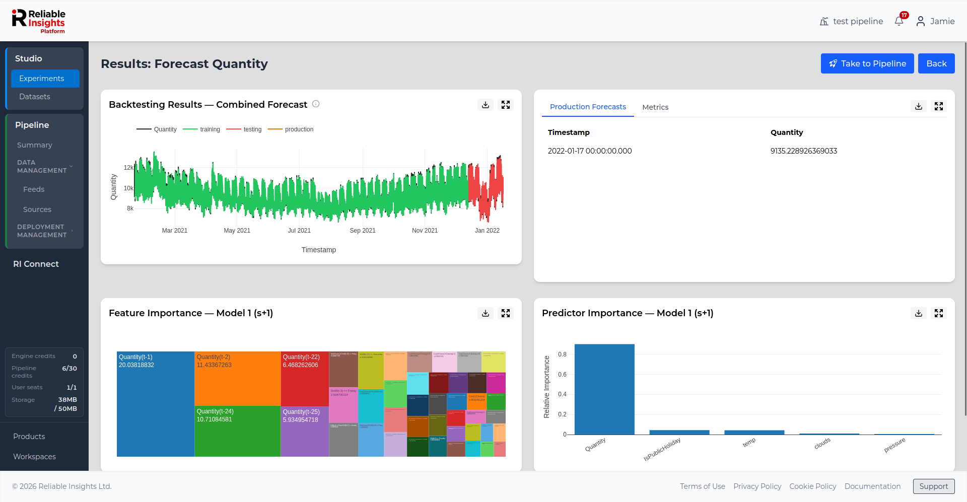
Backtesting Results
Backtesting helps you understand how well a forecasting model performs on historical data.
Studio builds the model using the training range and then tests it against the validation range. This shows how closely the model predictions match known values that were not used during training.
Backtesting is useful because it gives an early indication of how well the model may perform when forecasting future values.
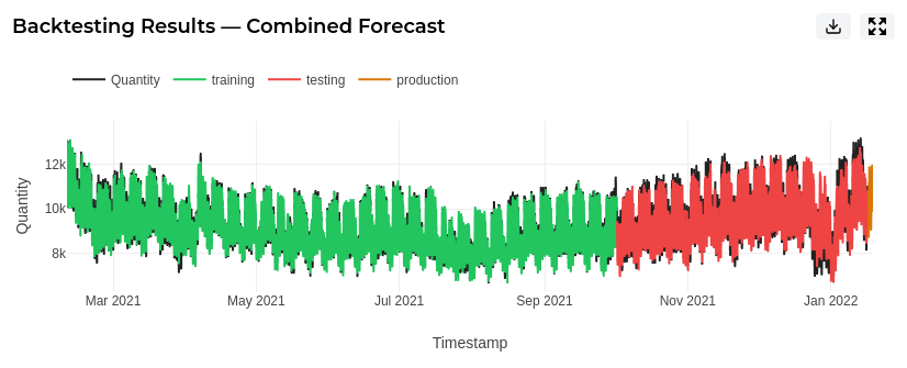
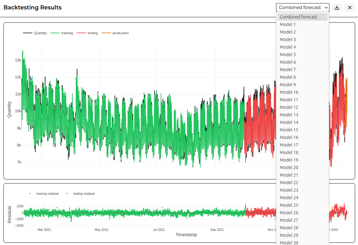
You can interact with the plot to zoom in on areas of interest. This can help you inspect specific periods in more detail, such as the shape of the production forecast.
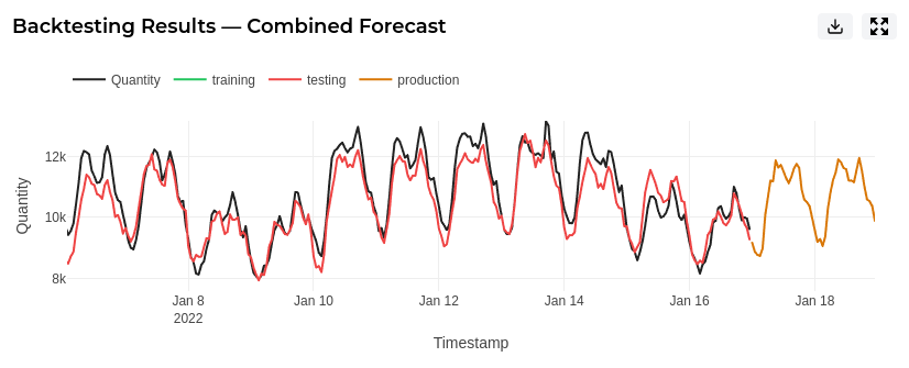
You can also enlarge the backtesting results to inspect the plot in more detail. The enlarged view includes residuals, which can help you identify where the model performed well and where it performed less accurately.
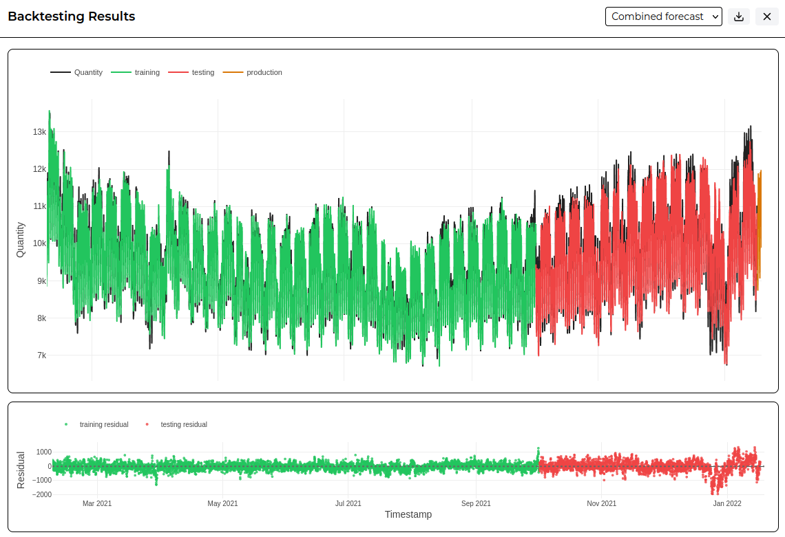
From the enlarged view, you can select individual models to review how each model performs. This is useful when an experiment has created multiple models across the forecast horizon and you want to inspect one model at a time.
The enlarged view also allows you to show the predictors used by the model on the same plot as the forecast. Use Show predictors to add the predictor series to the backtesting plot, and Hide predictors to return to the forecast-only view.
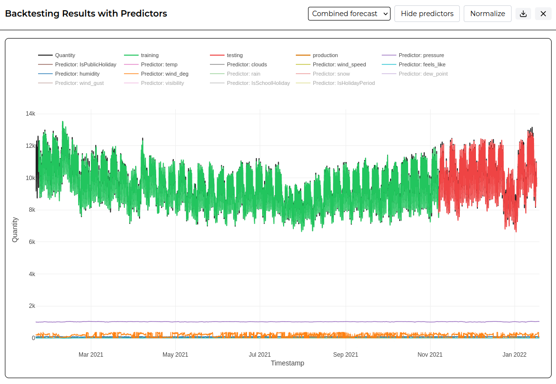
In raw value mode, each series is shown using its original scale. This is useful when the target and predictors use comparable units or similar value ranges. If one series has much larger values than the others, smaller series may appear compressed near the bottom of the plot.
Use Normalize to scale the visible series between 0 and 1. This makes it easier to compare the shape and timing of the target, forecast, and predictors, even when they use different units or value ranges.
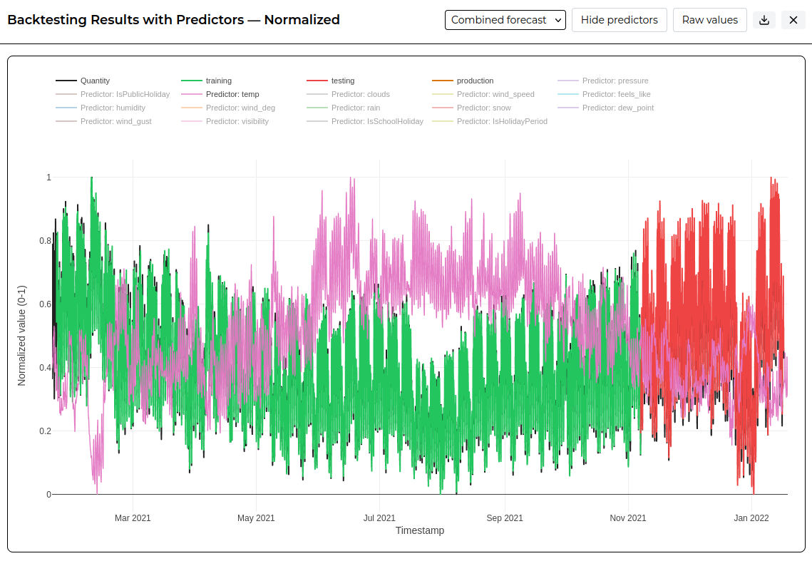
Normalisation changes only how values are displayed in the plot. It does not change the original experiment data, model results, forecast values, or exported result values.
You can use the legend to show or hide individual predictors. This is helpful when a plot contains many predictors or when one predictor makes the other series harder to inspect.
Feature Importance
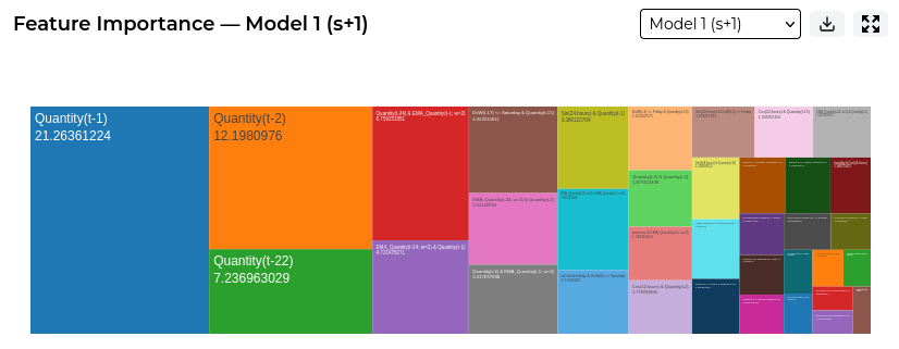
The Feature Importance plot shows which individual features had the greatest influence on a selected model.
While Predictor Importance shows which input columns were most influential, Feature Importance provides a more detailed view. It shows which engineered features, such as lagged values, moving averages, or other transformations, contributed most to the model output.
This helps you understand the specific patterns or relationships Studio used when generating the forecast.
By default, Studio shows the feature importance for Model 1 (s+1), which represents the first forecast step after the current sample. You can use the model selector to view feature importance for other models created by the experiment.
Production Forecast
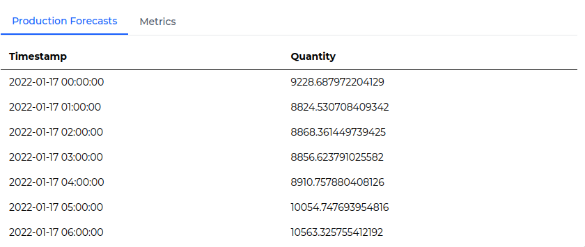
The Production Forecast shows the predicted values for the selected target variable over the chosen forecast horizon.
The table lists each future timestamp alongside the forecasted value for the target. This allows you to review the expected future behaviour of the target and identify upcoming trends or changes.
Model Metrics
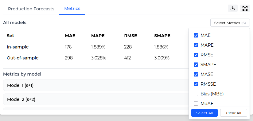
Model metrics help you evaluate the performance of a forecasting experiment. They show how closely the model’s predictions match the observed values and help you understand the size of the prediction errors.
Studio displays metrics for both in-sample and out-of-sample performance:
- In-sample metrics show how well the model performed on the data used during training.
- Out-of-sample metrics show how well the model performed on validation data that was not used during training.
You can use the Select Metrics dropdown to choose which metrics are displayed.
The All models section provides an overall summary across the experiment. You can also review metrics for individual models in the Metrics by model section. This allows you to compare how each model performed and identify where performance may vary across the forecast horizon.
The table below shows the metrics available in Studio and explains how to interpret them.
Anomaly Detection Results
Anomaly Detection results help you review where Studio identified unusual behaviour in the selected KPI. These results show the detected anomalies, the indicators that contributed to those detections, and the features or predictors that had the greatest influence on the model.
Detections
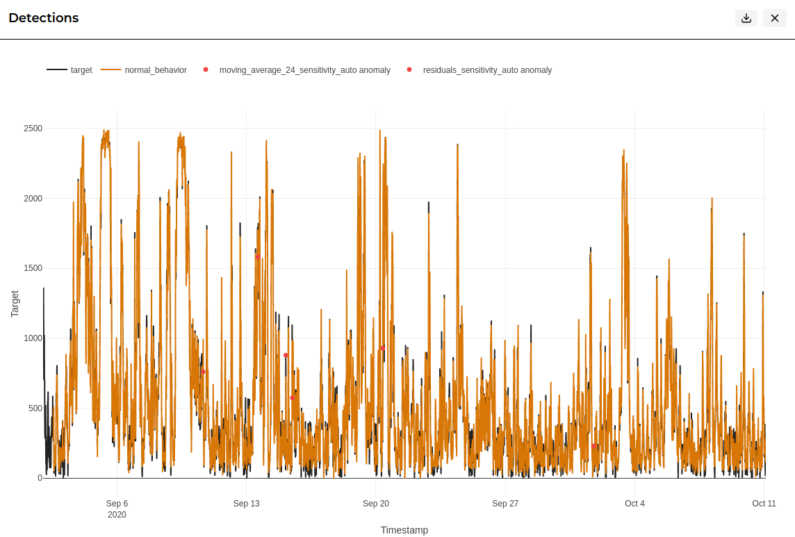
The Detections plot shows the KPI over time and highlights the points where Studio identified anomalous behaviour.
This view helps you see where anomalies occurred in the context of the wider time series. It can be useful for spotting isolated spikes, unusual patterns, or periods where the KPI behaved differently from expected.
Anomaly Indicators
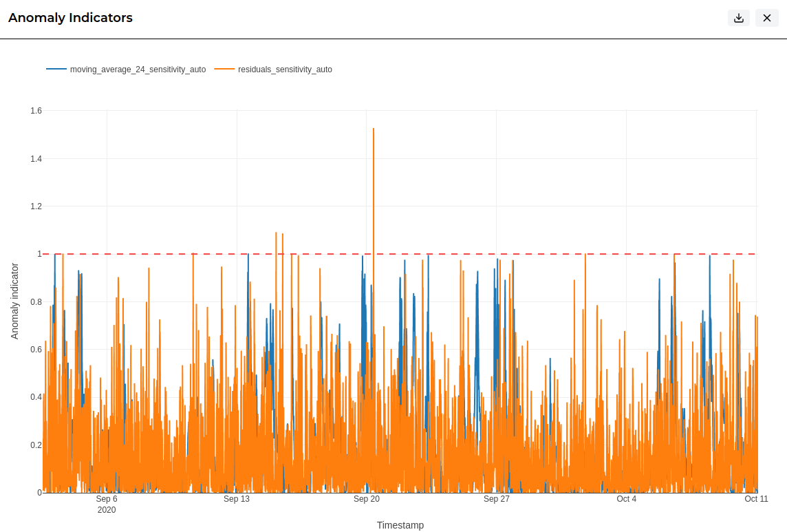
The Anomaly Indicators plot shows the indicator values used to identify unusual behaviour. These indicators help explain why certain points were flagged as anomalies.
Higher indicator values suggest stronger evidence of anomalous behaviour. Reviewing this plot can help you understand whether anomalies were isolated events or part of a wider pattern.
Feature & Predictor Importance
The Feature and Predictor Importance plots help explain which inputs had the greatest influence on the anomaly detection model.
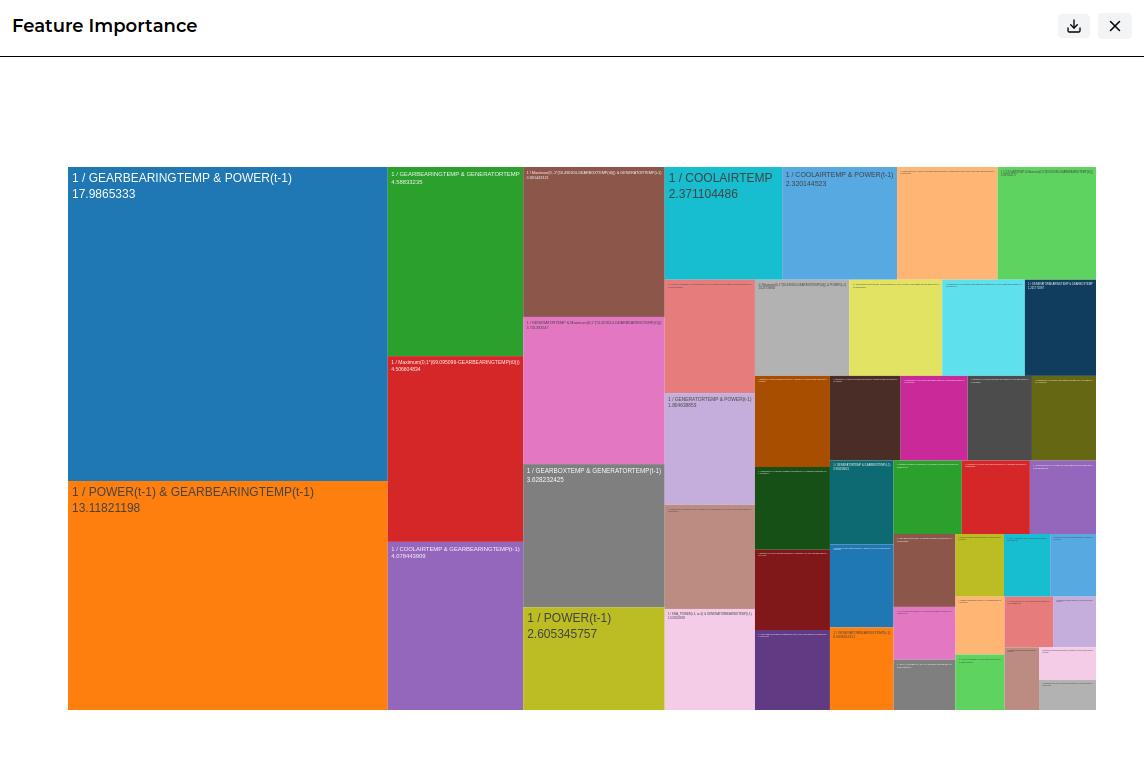
The Feature Importance plot shows which individual engineered features contributed most to the model. These may include transformed values, lagged values, or other features created from the original dataset.
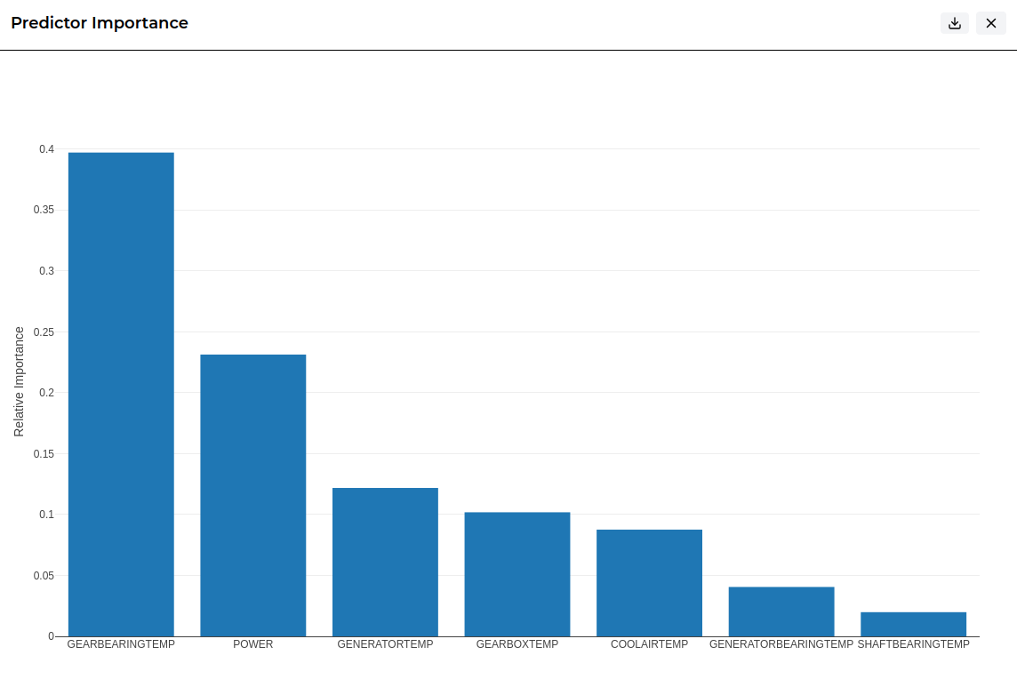
The Predictor Importance plot shows which original predictor columns were most influential. This provides a higher-level view of the factors that contributed most to the anomaly detection results.
Anomalies
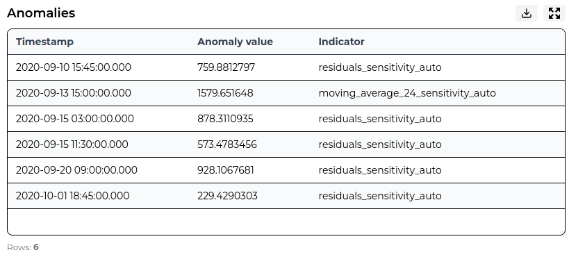
The Anomalies table lists the individual points that Studio identified as anomalous.
For each anomaly, the table shows the timestamp, anomaly value, and the indicator that triggered the detection. This gives you a clear list of the events that may require further review or investigation.
Causal Links Results
Causal Links results help you understand which variables, features, and time-based relationships were most strongly linked to the selected target.
These results are designed to support investigation. They show which inputs had the greatest influence, how past values may relate to the target, and which engineered features contributed most to the model.
Parameter Importance
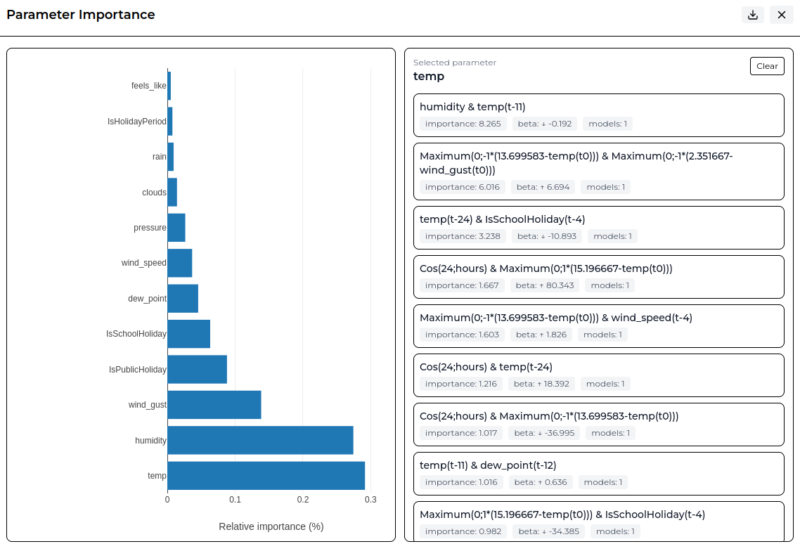
The Parameter Importance plot shows which original dataset columns had the greatest relative importance in the Causal Links experiment.
Higher values indicate that a parameter had a stronger influence on the model output. Selecting a parameter shows more detail about the features or combinations that contributed to its importance.
This helps you identify which variables are most strongly linked to the selected target.
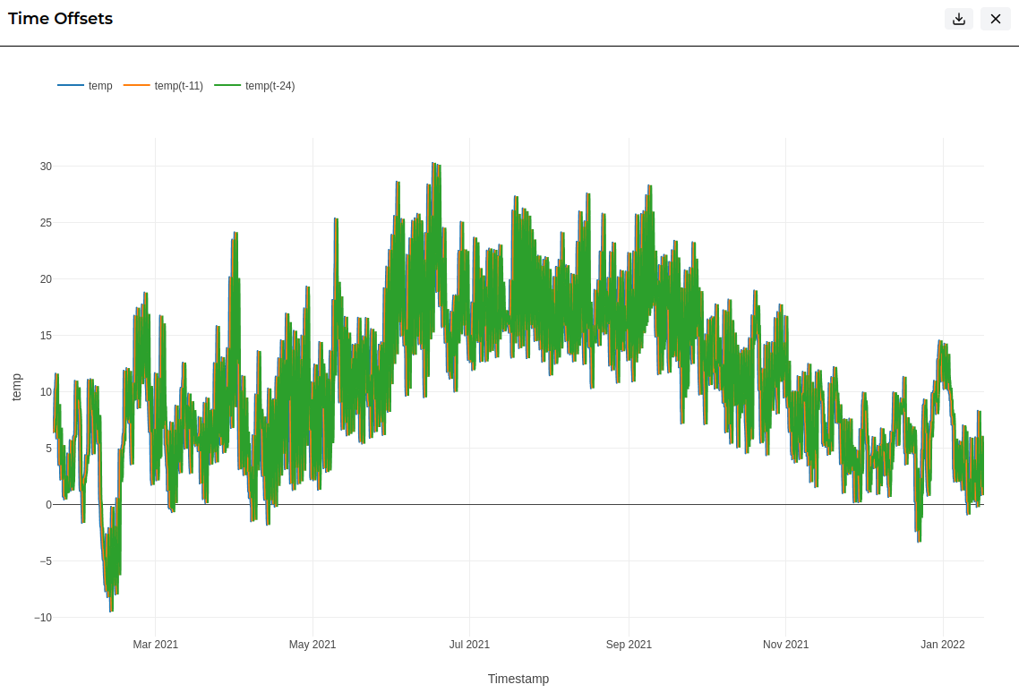
Time Offsets
The Time Offsets plot shows how a selected parameter behaves over time, including any shifted versions of that parameter used by the model.
For example, a value such as temp(t-11) represents the temperature value from an earlier point in time. This helps show whether past values of a parameter may have contributed to the target result.
This view is useful for understanding delayed relationships, where a change in one variable may be linked to a change in the target later on.
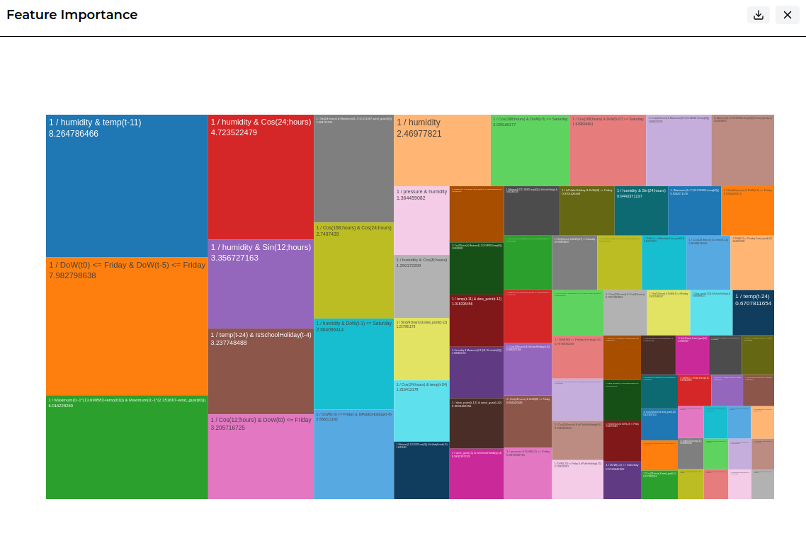
Feature Importance
The Feature Importance plot shows which engineered features had the greatest influence on the Causal Links model.
Features can include transformed values, time-offset values, or combinations of inputs created during modelling. Larger blocks represent features with higher relative importance.
This helps you understand the specific relationships Studio identified as most useful when explaining the selected target.
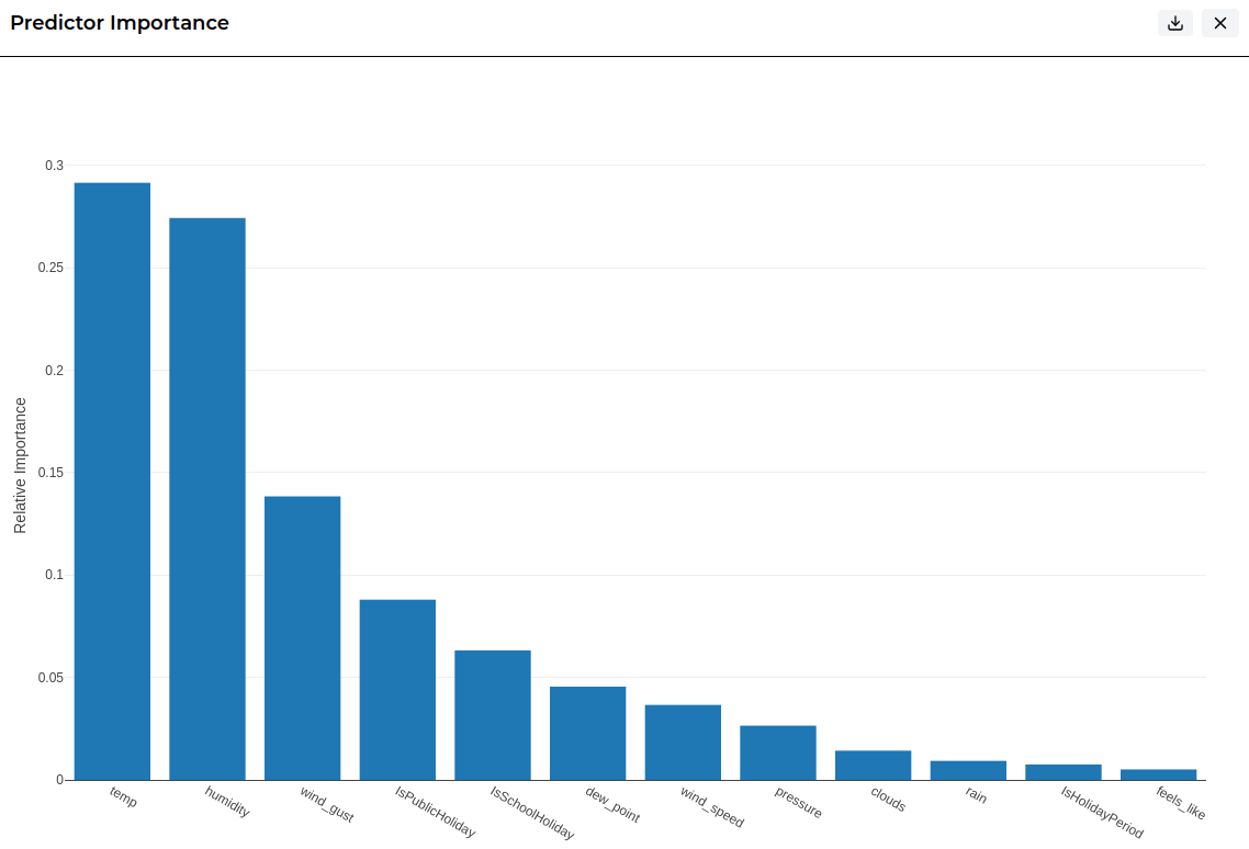
Predictor Importance
The Predictor Importance plot provides a higher-level view of which original predictor columns were most influential.
While Feature Importance shows the detailed engineered features used by the model, Predictor Importance groups this information back to the original input variables. This makes it easier to see which dataset columns had the strongest overall relationship with the target.
Soft Sensor Results
Soft Sensor results show how Studio estimated values for a selected target variable using the relationships found in the rest of the dataset.
These results help you review the inferred values, understand model performance, inspect uncertainty, and identify which features and predictors had the greatest influence on the soft sensor model.
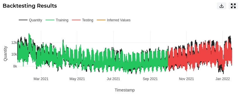
Backtesting Results
Backtesting helps you understand how well the soft sensor model performs on historical data.
Studio builds the model using the training range and then tests it against the validation range. This shows how closely the inferred values match known values that were not used during training.
Backtesting is useful because it gives an indication of how reliable the soft sensor may be when estimating values that are missing, unavailable, or difficult to measure directly.
Inferred Values
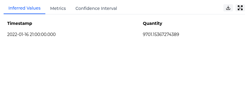
The Inferred Values table shows the values estimated by the soft sensor model.
Each row shows a timestamp and the inferred value for the selected target. This allows you to review the estimated values directly and use them as a completed or extended version of the target variable.
Metrics
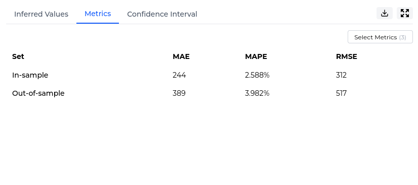
Metrics help you evaluate how accurately the soft sensor model estimated the target variable.
Studio displays metrics for both in-sample and out-of-sample performance:
- In-sample metrics show how well the model performed on the data used during training.
- Out-of-sample metrics show how well the model performed on validation data that was not used during training.
Confidence Interval
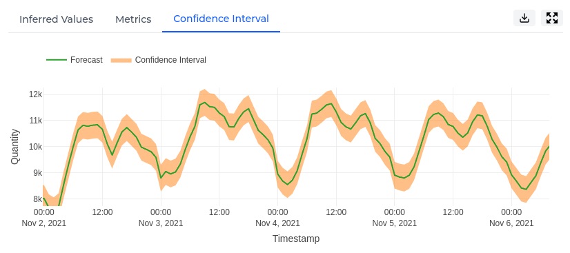
The Confidence Interval plot shows the inferred values together with an uncertainty range around them.
The inferred value line shows the model’s estimated value for the target. The confidence interval shows the range within which the true value is expected to fall. A wider interval indicates greater uncertainty, while a narrower interval indicates more confidence in the estimate.
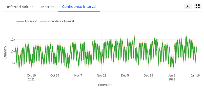
You can zoom into the plot to inspect specific periods in more detail. This can help you understand where the model is more or less certain about the inferred values.
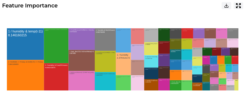
Feature Importance
The Feature Importance plot shows which individual features had the greatest influence on the soft sensor model.
Features can include transformed values, lagged values, moving averages, or other engineered features created from the original dataset. Larger blocks represent features with higher relative importance.
This helps you understand the specific patterns or relationships Studio used when estimating the target variable.
Predictor Importance
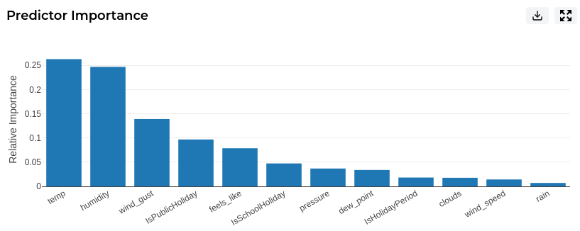
The Predictor Importance plot provides a higher-level view of which original predictor columns were most influential.
While Feature Importance shows the detailed engineered features used by the model, Predictor Importance groups this information back to the original input variables. This makes it easier to understand which dataset columns contributed most to the inferred values.
Taking an experiment to Pipeline
After reviewing the results of a completed Studio experiment, you may decide that the experiment is ready to be used operationally.
Studio is designed for interactive experimentation. Pipeline is designed for scheduled, operational workflows. Use Take to Pipeline to turn an eligible Studio experiment into a recurring Pipeline deployment that runs on a schedule.
This is useful when you have tested a forecasting or anomaly detection experiment in Studio and want to productionise it using live Pipeline feeds.
The Take to Pipeline workflow helps you:
- Map Studio experiment features to Pipeline feeds.
- Configure the deployment name, description, schedule, and deployment settings.
- Review the configuration before creating the Pipeline deployment.
Taking an experiment to Pipeline creates a Pipeline deployment. The original Studio experiment and its results remain available in Studio.
Step 1 - Feature Mapping
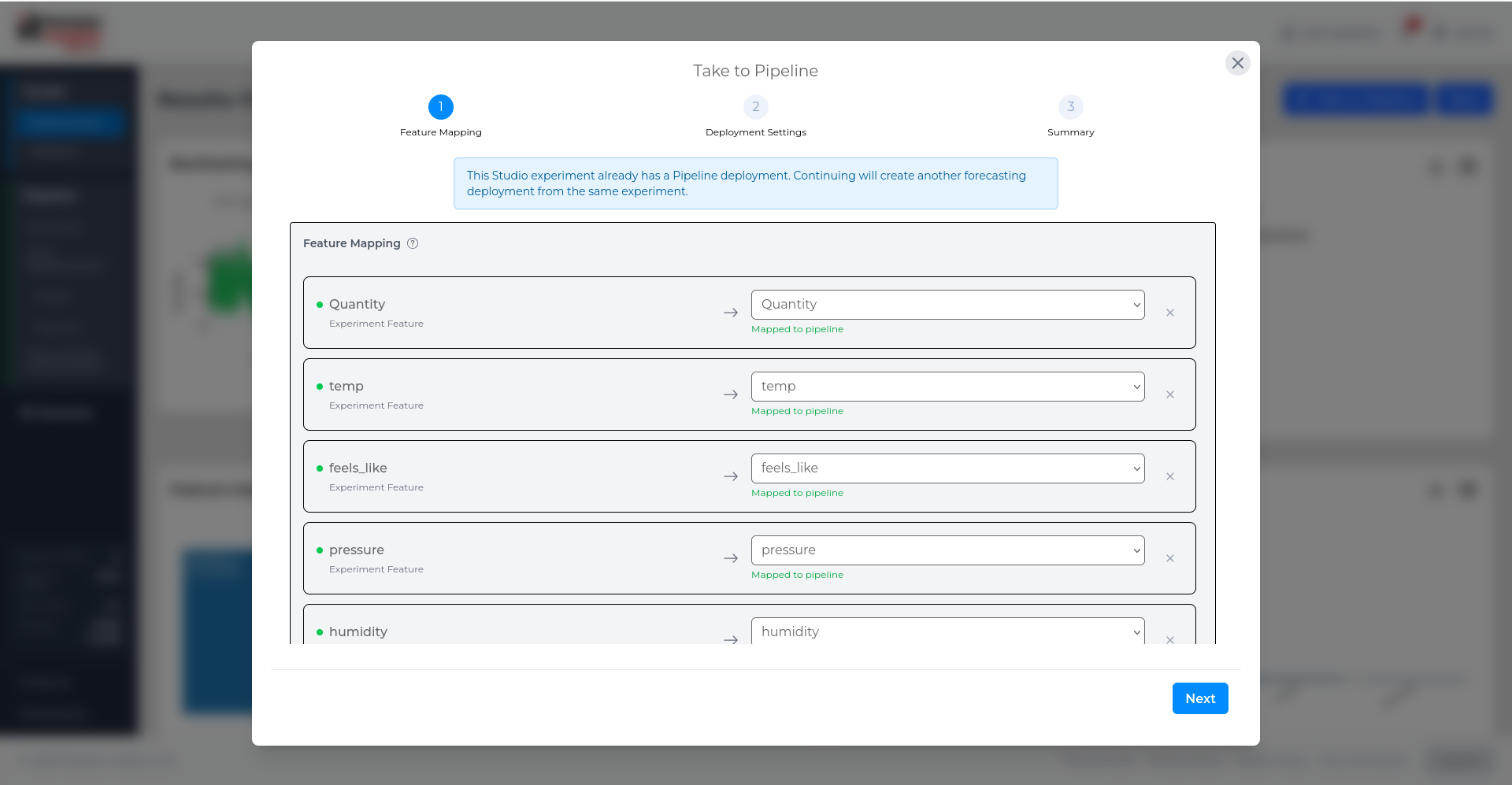
The first step maps the features used in the Studio experiment to Pipeline feeds.
Studio shows each experiment feature on the left and the matching Pipeline feed on the right. Where possible, RI Platform automatically matches experiment features to existing Pipeline feeds with the same or similar names.
Review the mappings before continuing. Each required experiment feature should be mapped to the correct Pipeline feed so that the deployment can run using live Pipeline data.
Step 2 - Deployment Settings
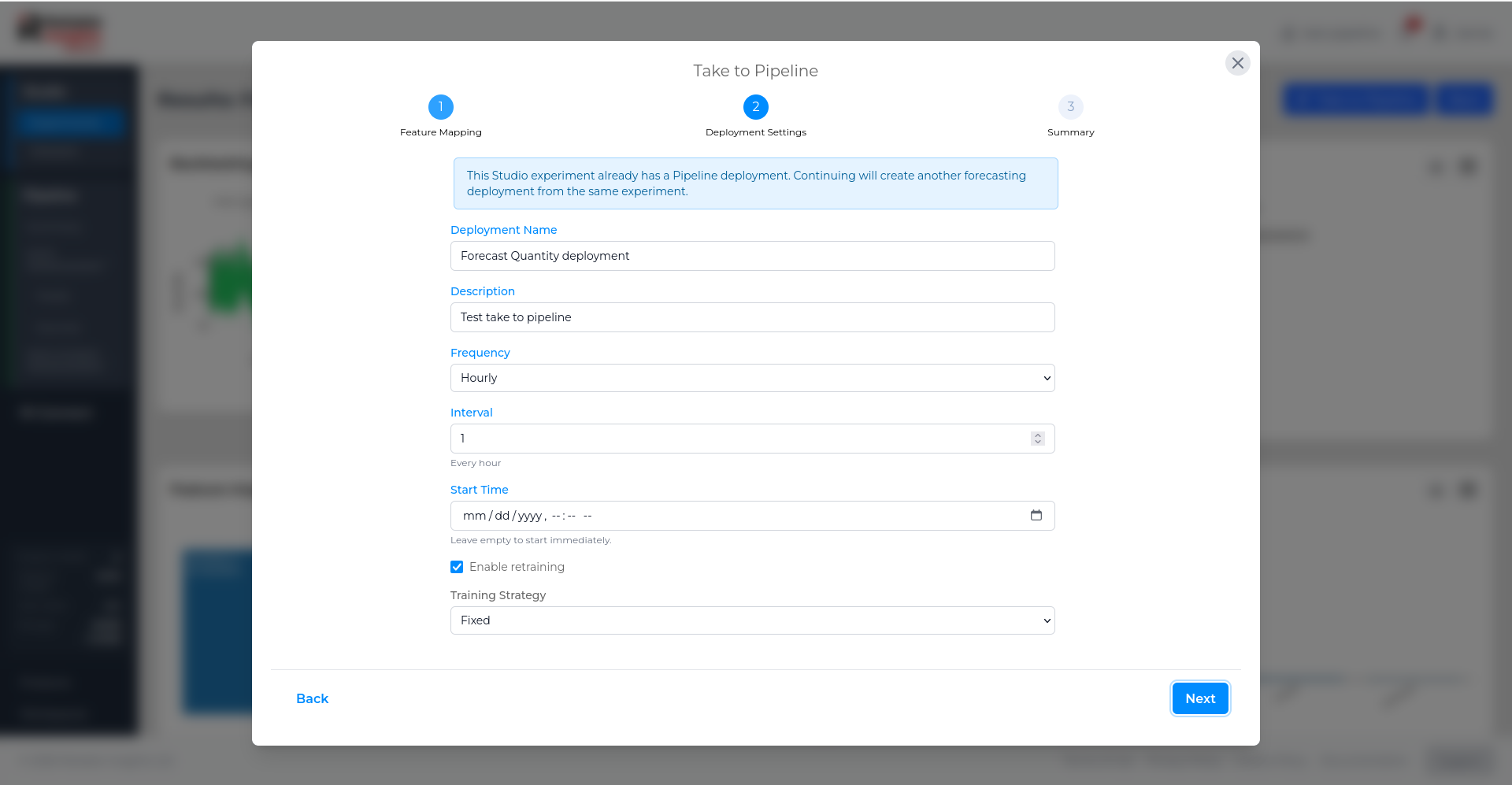
The second step configures how the Pipeline deployment should run.
For forecasting deployments, this includes the deployment name, description, schedule, retraining option, and training strategy.
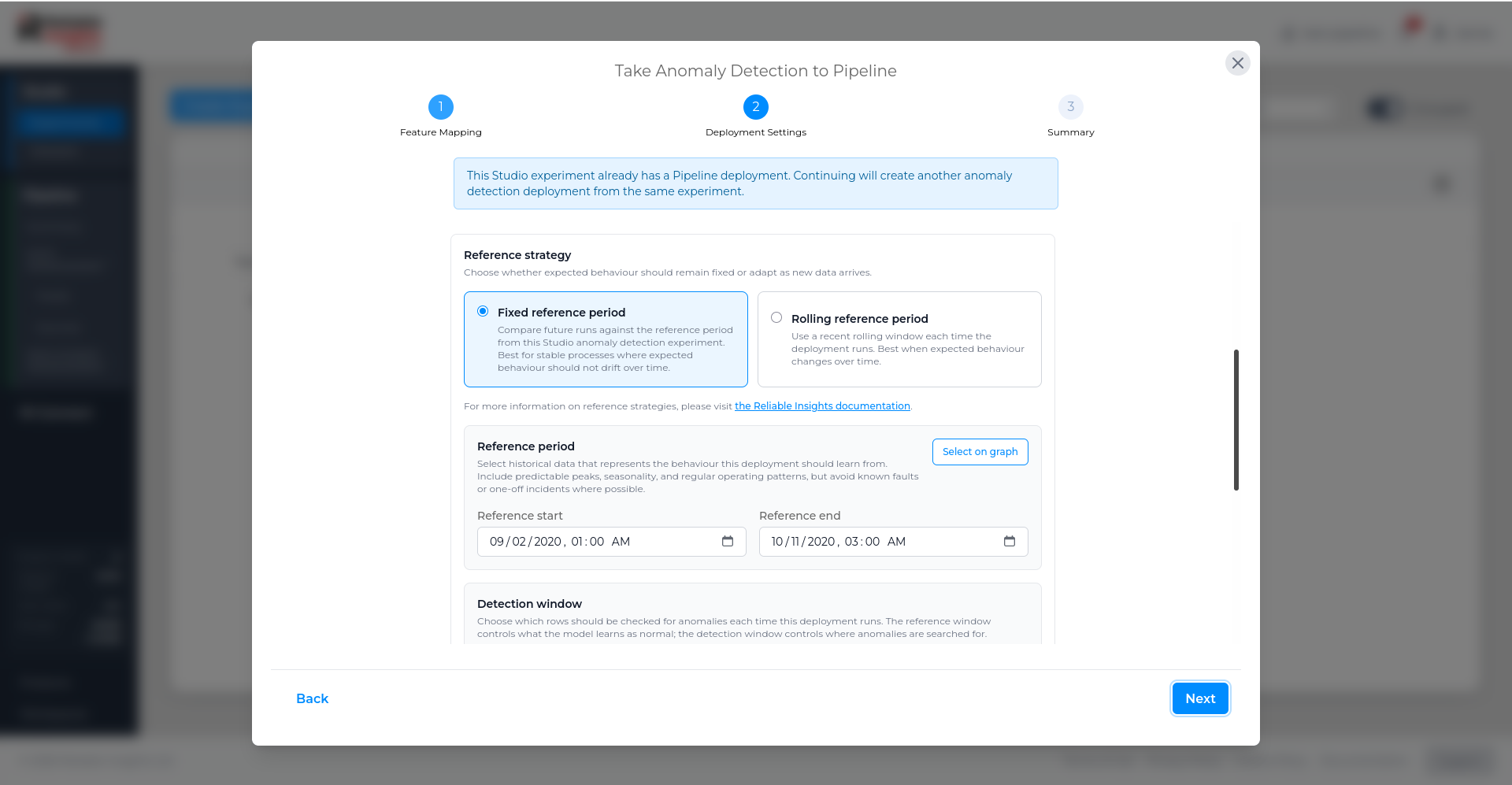
For anomaly detection deployments, the settings also include the reference strategy and detection window.
The reference strategy controls what the deployment treats as normal behaviour. A fixed reference period uses a selected historical period as the baseline, while a rolling reference period updates the baseline using a recent rolling window.
The detection window controls which rows are checked for anomalies each time the deployment runs.
Step 3 - Summary
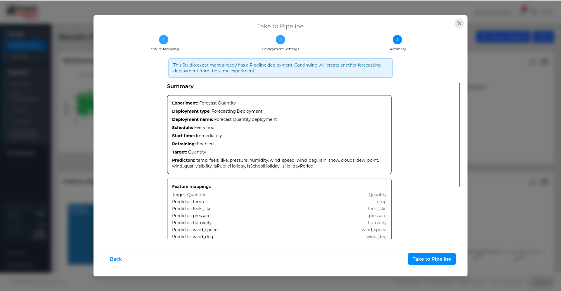
The final step summarises the Pipeline deployment before it is created.
Review the experiment, deployment type, schedule, selected target or KPI, predictors or explanatory variables, and feature mappings. When everything is correct, select Take to Pipeline to create the deployment.