Results
The Results page opens when you select Results from a deployment row on the Deployments page.
By default, it shows the output from the latest completed run for that deployment. You can also open the Results page for a previous deployment run from the Historic Results page. This allows you to inspect the full results for an earlier run, rather than only viewing the latest completed run.
The information shown on the Results page depends on the deployment type:
- Forecasting deployments show forecast results, backtesting results, production forecasts, metrics, feature importance, and predictor importance.
- Anomaly detection deployments show detected anomalies, anomaly indicators, anomaly tables, and the drivers that contributed to the detection results.
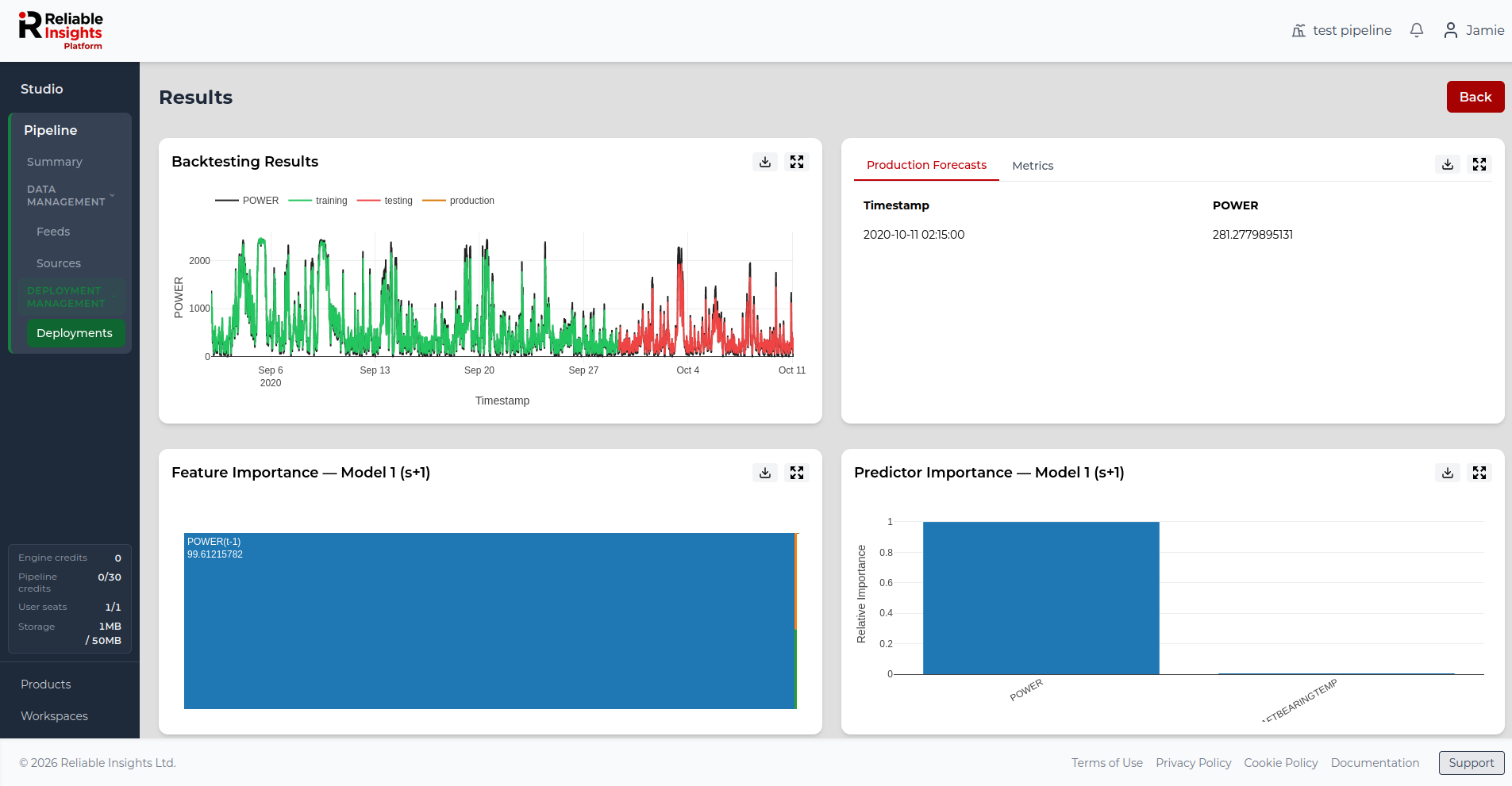
Latest and historic run results
Each deployment can produce multiple completed runs over time.
Use the latest Results page when you want to review the newest output for a deployment. Use Historic Results when you want to compare previous runs, review changes over time, or open the results for a specific earlier run.
For more information, see Viewing historic results.
Forecasting results
For forecasting deployments, the Results page shows how the model performed during backtesting, what it predicted for the production forecast window, and which features or predictors influenced the forecast.
The following sections apply to forecasting deployments.
Backtesting Results
Backtesting helps you understand how well the deployment model performed on historical data.
Pipeline builds the model using the training data and then tests it against data that was not used during training. This shows how closely the model predictions match known values.
Backtesting is useful because it gives an early indication of how well the deployment may perform when generating future forecasts.
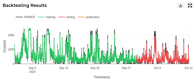
You can interact with the chart to inspect specific periods in more detail. Use this to review where the model followed the target closely and where prediction errors were larger.
Production Forecasts
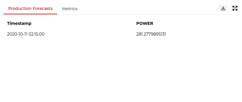
The Production Forecasts tab shows the predicted values generated by the latest deployment run.
The table lists each future timestamp alongside the forecasted value for the target feed. This allows you to review the expected future behaviour of the target and identify upcoming trends or changes.
Metrics
Model metrics help you evaluate the performance of the deployment model. They show how closely the model’s predictions matched observed values and help you understand the size of the prediction errors.
Pipeline displays metrics for both in-sample and out-of-sample performance:
- In-sample metrics show how well the model performed on the data used during training.
- Out-of-sample metrics show how well the model performed on data that was not used during training.
You can use the Metrics tab to review the available performance measures for the latest completed run.
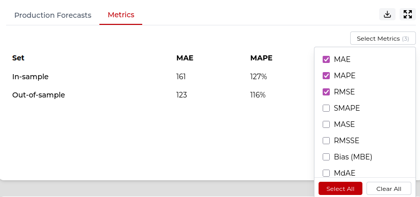
The table below shows the metrics available in Pipeline and explains how to interpret them.
Feature Importance
The Feature Importance plot shows which individual features had the greatest influence on the deployment model.
Features can include transformed values, lagged values, moving averages, or other engineered features created from the selected feeds. Larger blocks represent features with higher relative importance.
This helps you understand the specific patterns or relationships Pipeline used when generating the forecast.

Predictor Importance
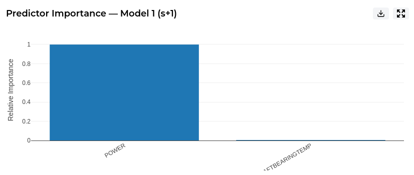
The Predictor Importance plot provides a higher-level view of which original predictor feeds were most influential.
While Feature Importance shows the detailed engineered features used by the model, Predictor Importance groups this information back to the original inputs. This makes it easier to see which feeds contributed most to the forecast.
Anomaly detection results
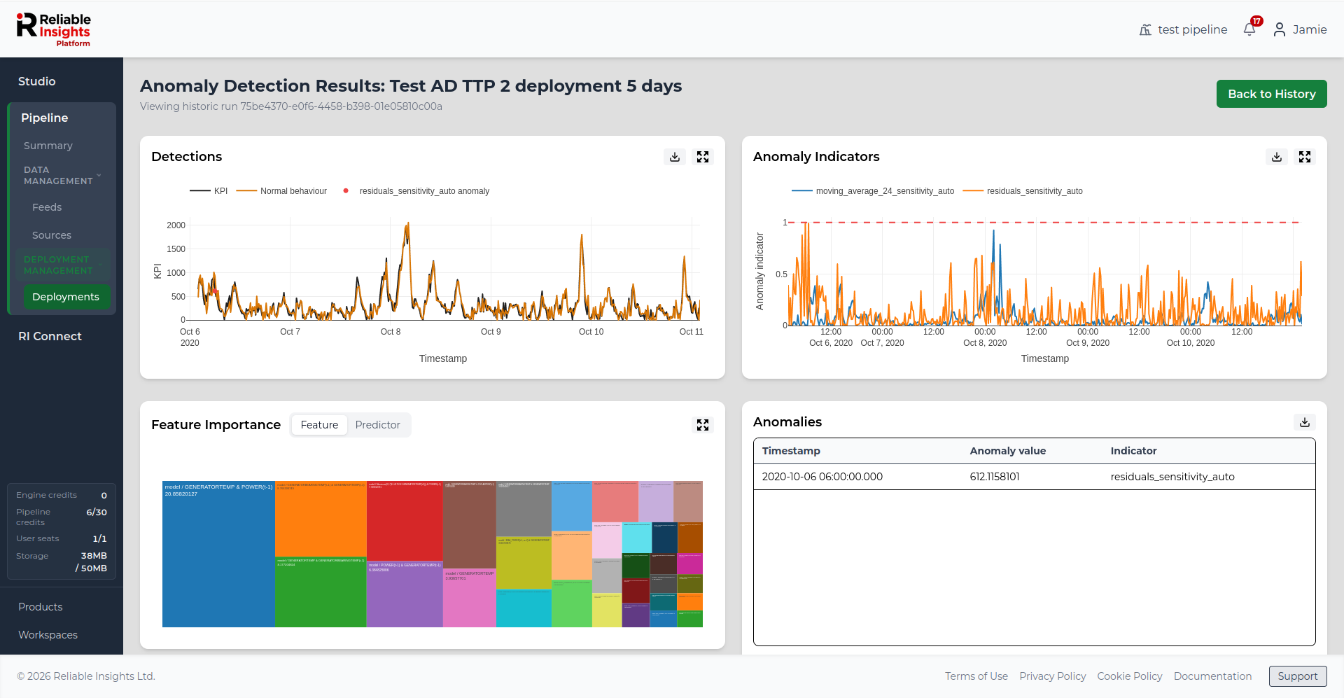
For anomaly detection deployments, the Results page shows where anomalies were detected, how anomaly indicators behaved over time, and which variables contributed most to the results.
Detections
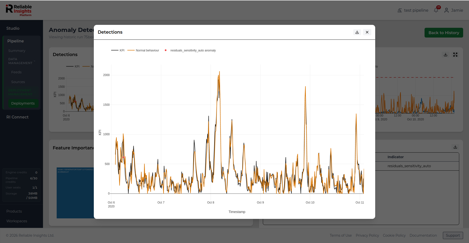
The Detections chart compares the selected KPI against the expected normal behaviour for the selected run.
Detected anomalies are highlighted on the chart, making it easier to see where the observed behaviour differed from the expected pattern. This helps users review when unusual behaviour occurred and how it relates to the KPI trend.
Anomaly Indicators
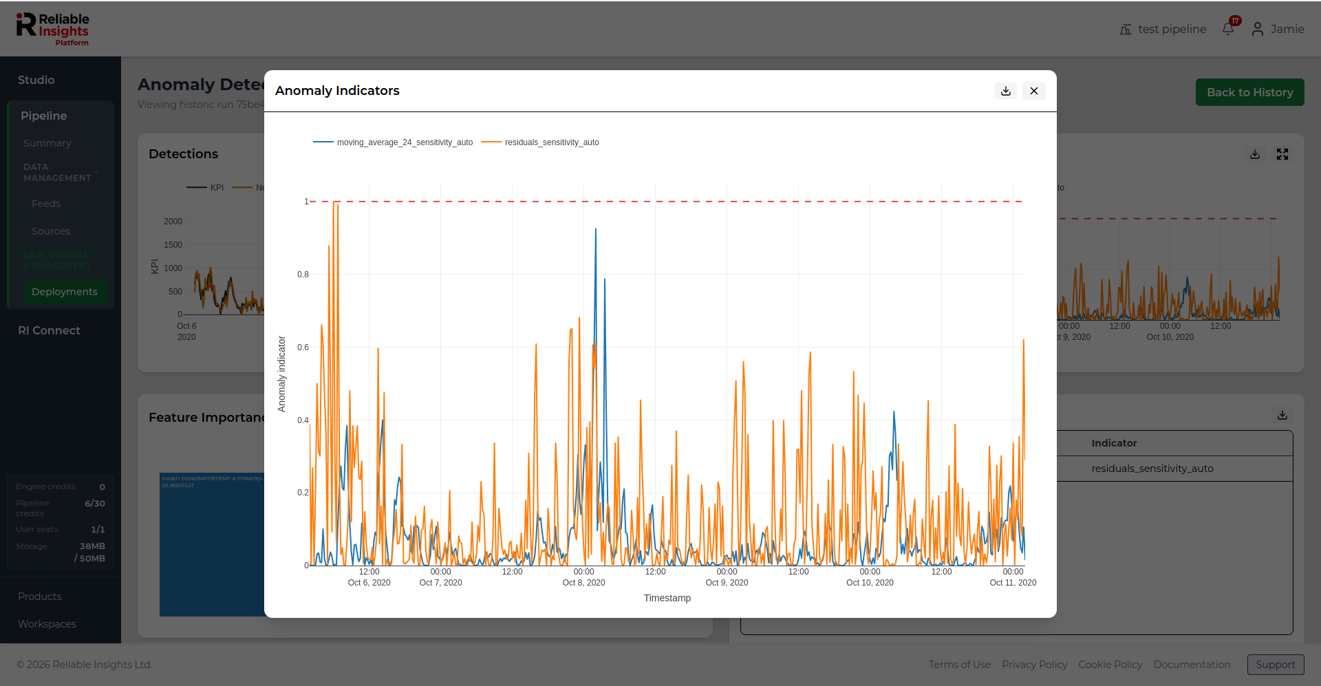
The Anomaly Indicators chart shows the anomaly indicator values used by the deployment run.
These indicators help show how strongly the model considered each point to be unusual. Higher indicator values suggest stronger evidence of anomalous behaviour.
Feature Importance and Predictor Importance
The importance panels help explain which model features and original input feeds contributed most to the anomaly detection results.
- Feature Importance shows the detailed engineered features used by the model.
- Predictor Importance groups importance back to the original Pipeline feeds, making it easier to understand which input variables were most influential.
Use these views to understand possible drivers behind detected anomalies and to support further investigation.
Anomalies table
The Anomalies table lists the anomalies detected during the selected run.
The table includes the timestamp, anomaly value, and the indicator associated with the anomaly. Use this table when you need to review specific anomalous records or export anomaly information for further investigation.
Downloading results
Each results panel includes a download button where export is available. Use this to export the data behind a chart or table for offline analysis, reporting, or use in another tool.
For forecasting deployments, this may include production forecast values, model metrics, feature importance data, or predictor importance data.
For anomaly detection deployments, this may include detected anomalies, anomaly indicators, feature importance data, or predictor importance data.